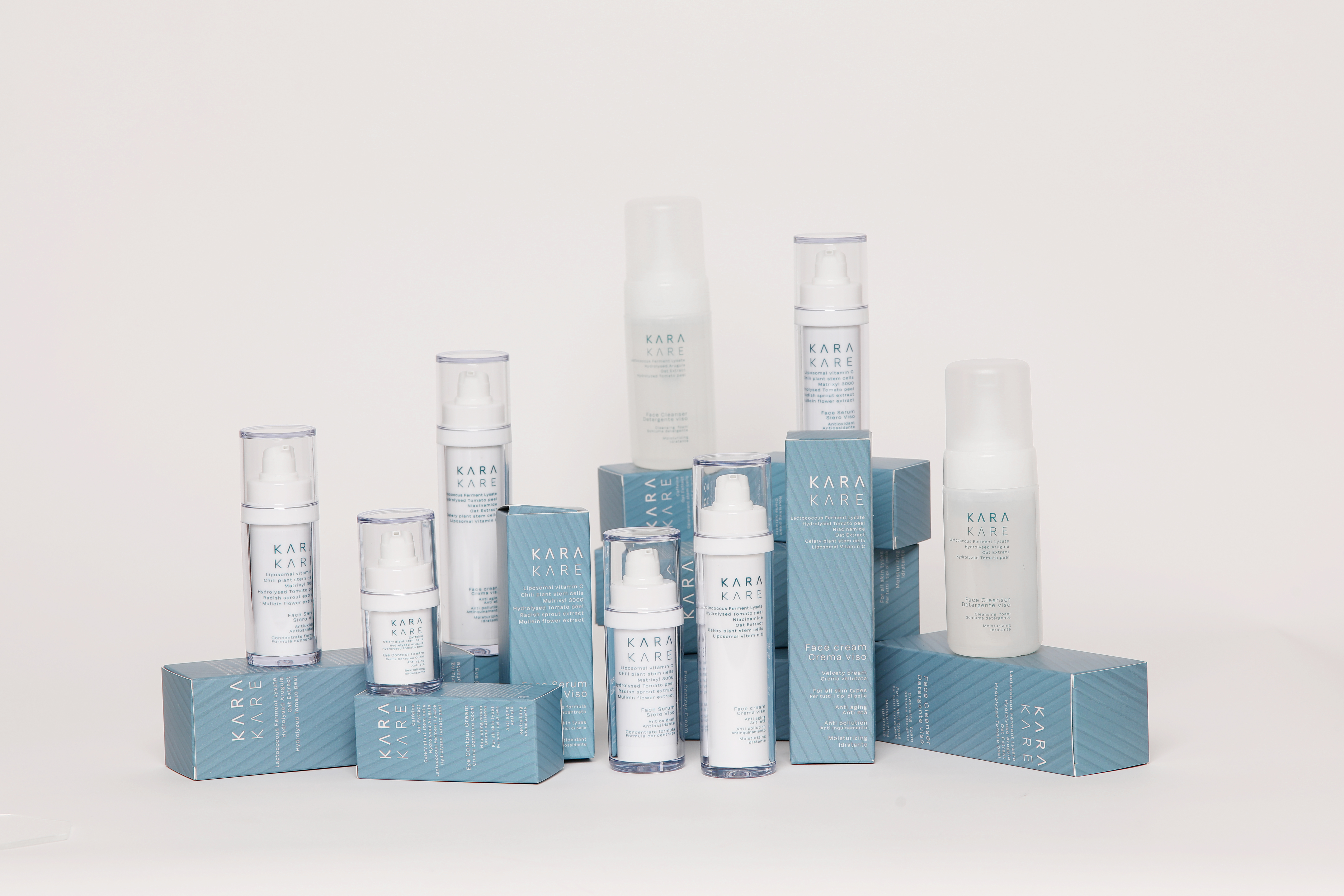
Developed the branding strategy and design for a new Skincare brand emerging in an increasingly competitive and saturated market. The brands ethos is deeply rooted in pharmaceuticals and biotechnology.
The foundation of the formulas started from «Prevent and Treat», exactly the same way medication functions. It works to treat the skins ‘Microbiome’.
BRAND MANIFESTO:
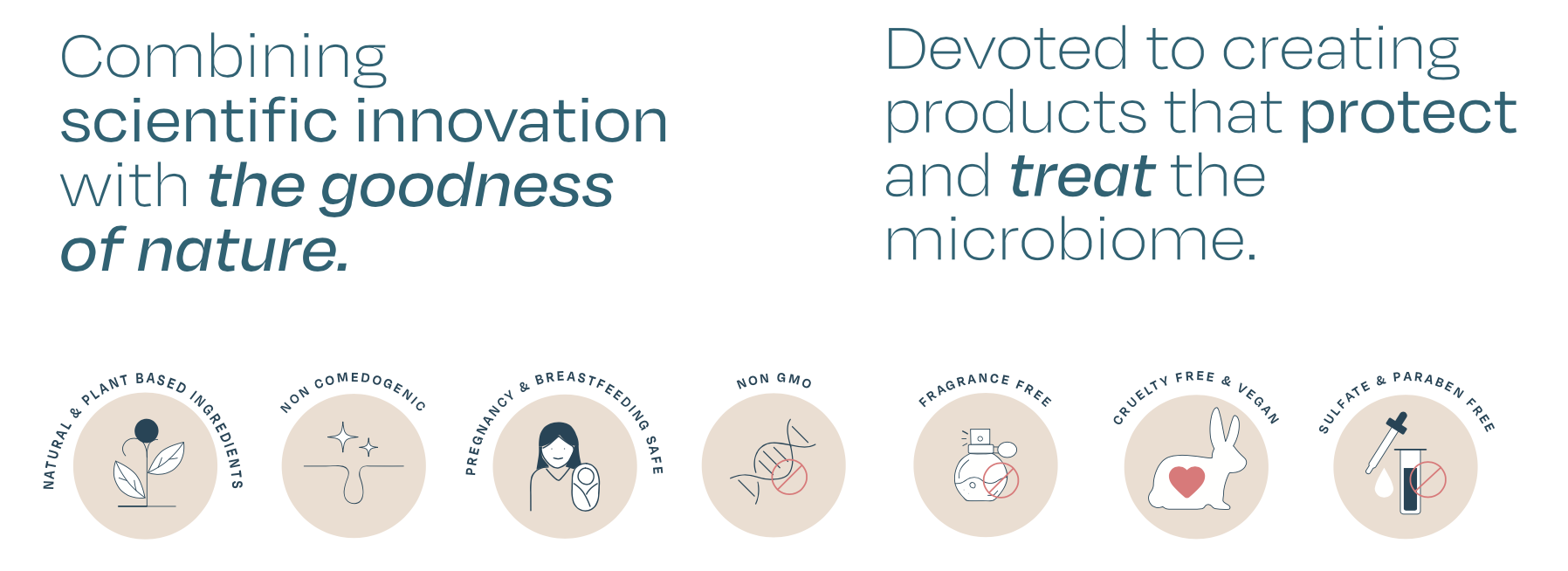
With its ethos deeply rooted in sustainability, Kara Kare is devoted to creating products that protect and treat the microbiome. Our formulas have been developed using biotechnology, combining the benefits of plant extracts and various enzymatic mechanisms with the most effective active ingredients. We are committed to making a positive impact on the environment, through the use of ‘upcycled’ ingredients that would otherwise be wasted and by minimising the carbon footprint of our supply chain.
![]()
An important element before developing the design of the brand was creating the brand name. KARA KARE come from founders name as the playing with the interesting alliteration with the word ‘kare’ in place of ‘care’. The brand name is aimed to be sold in various markets so it was imperative that the brand name was easy to read and pronounce.
![]()
![]()
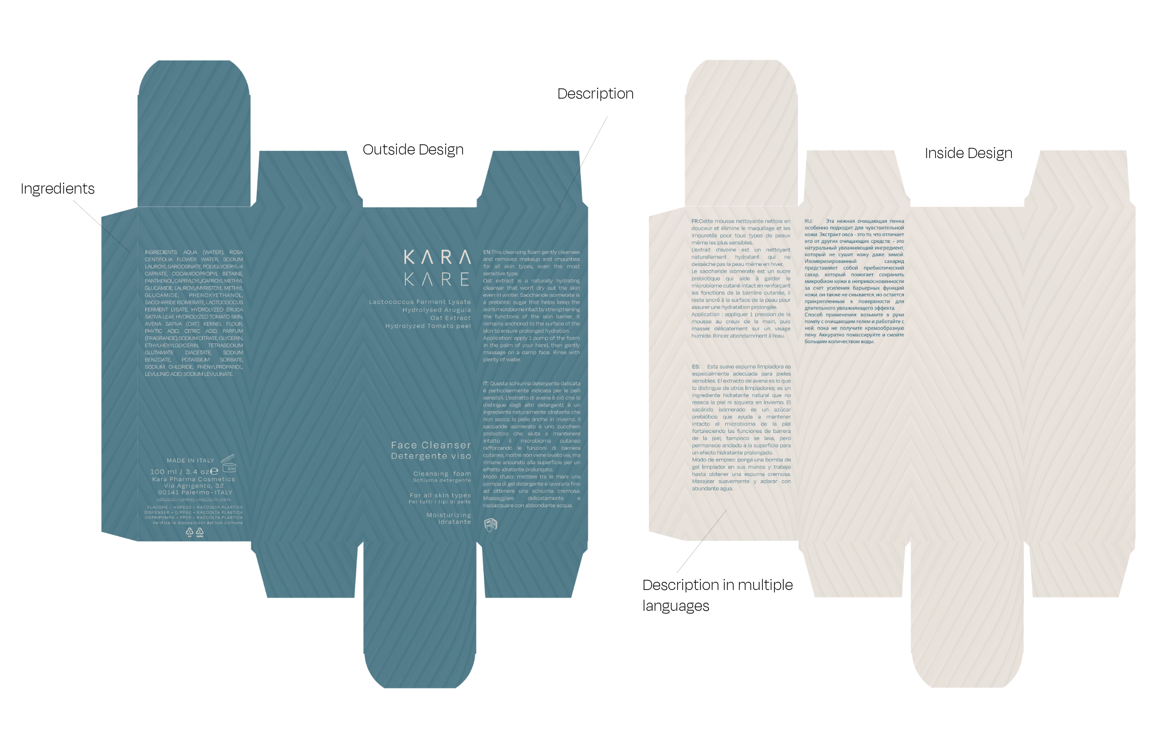
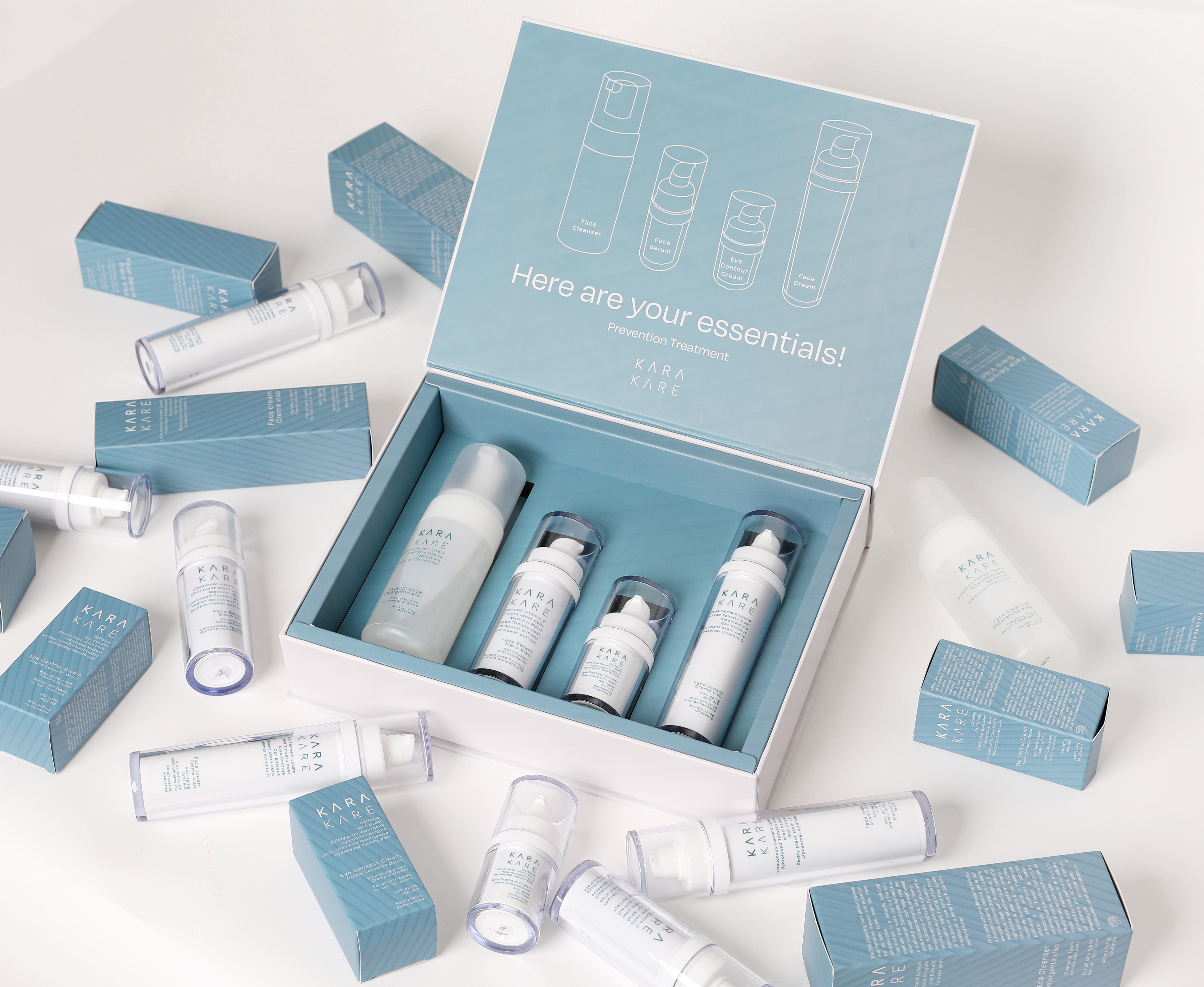
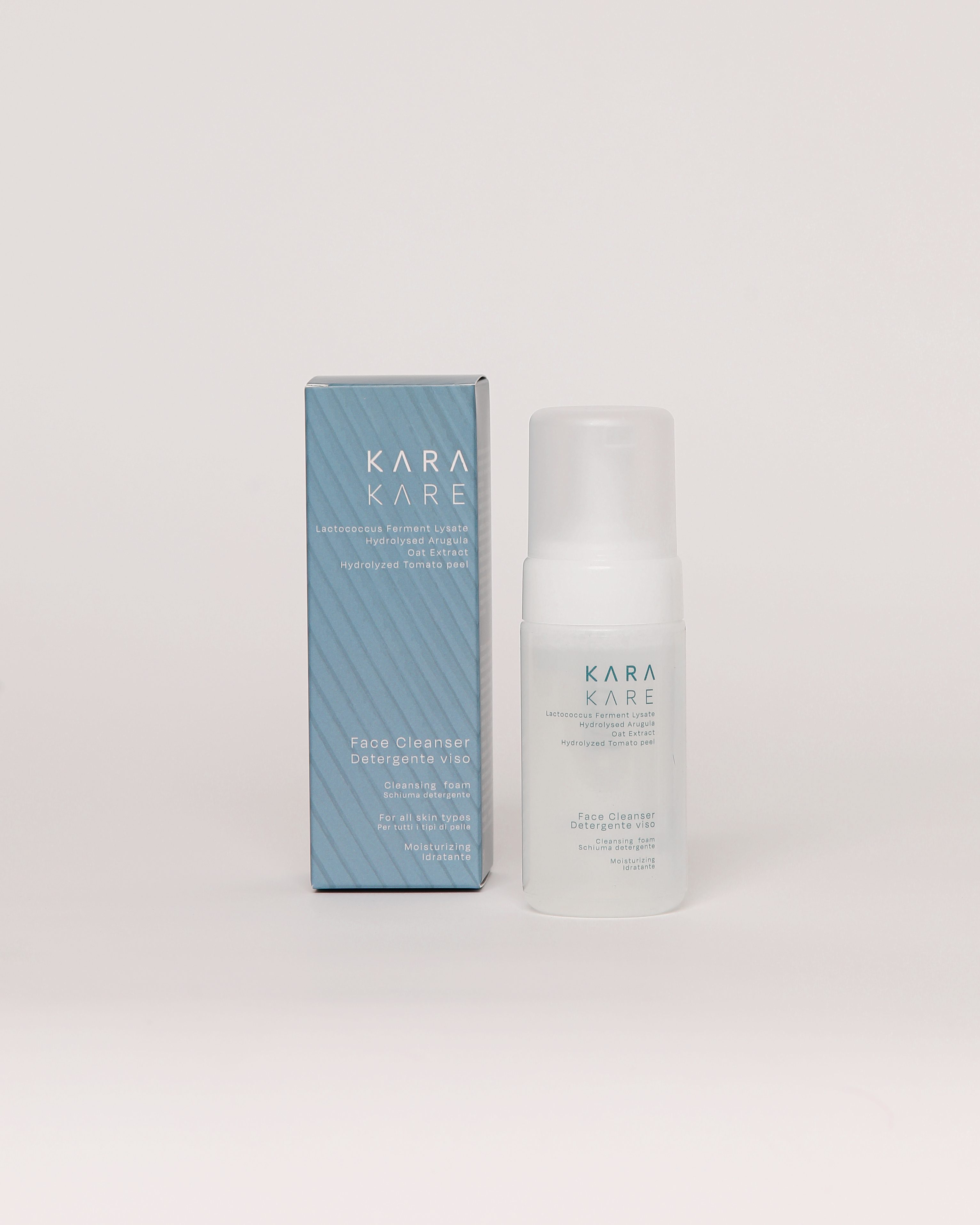
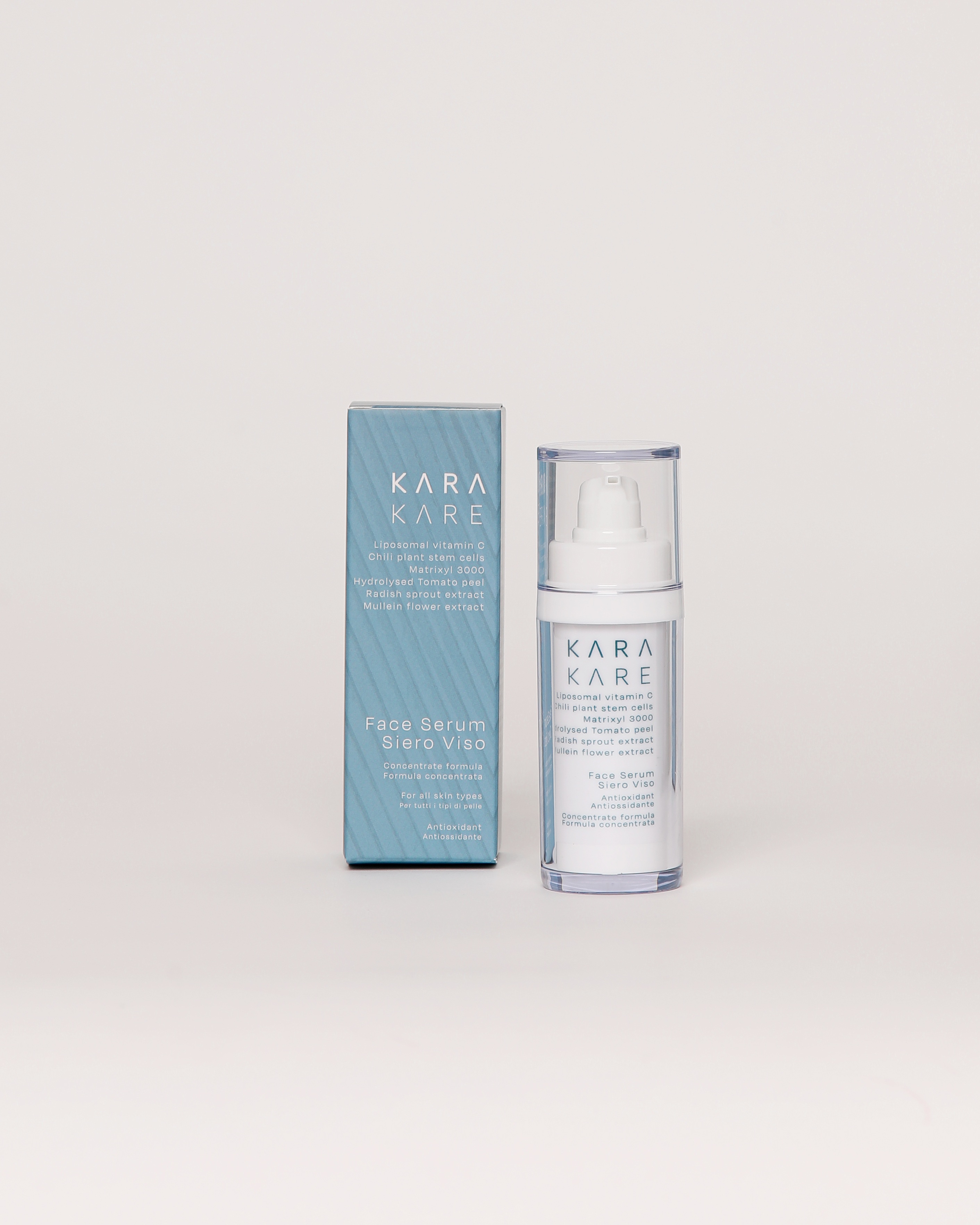
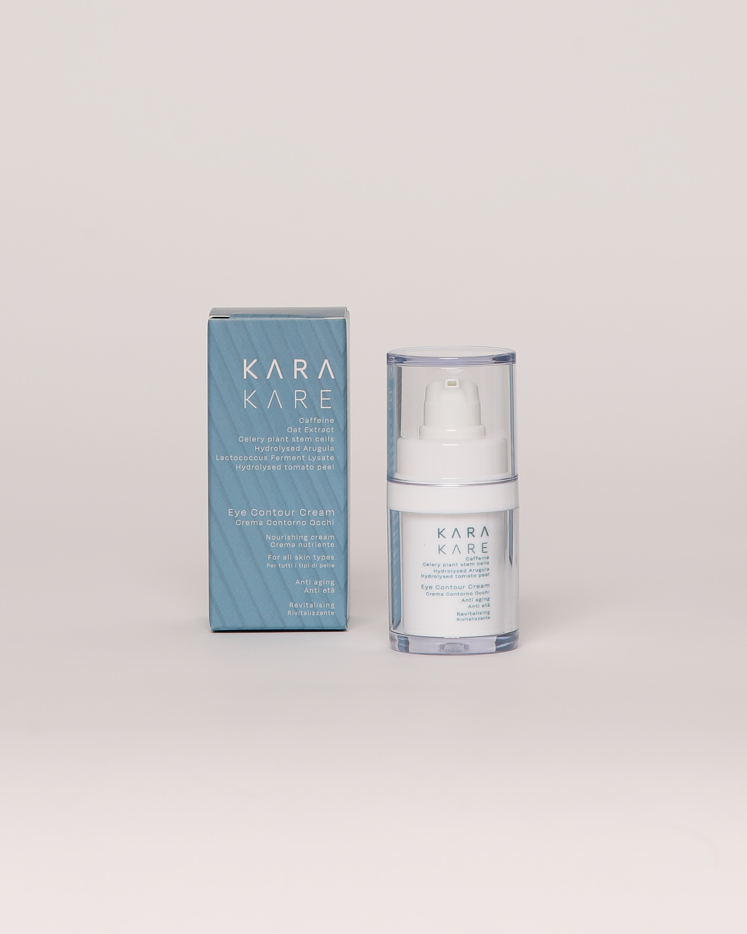
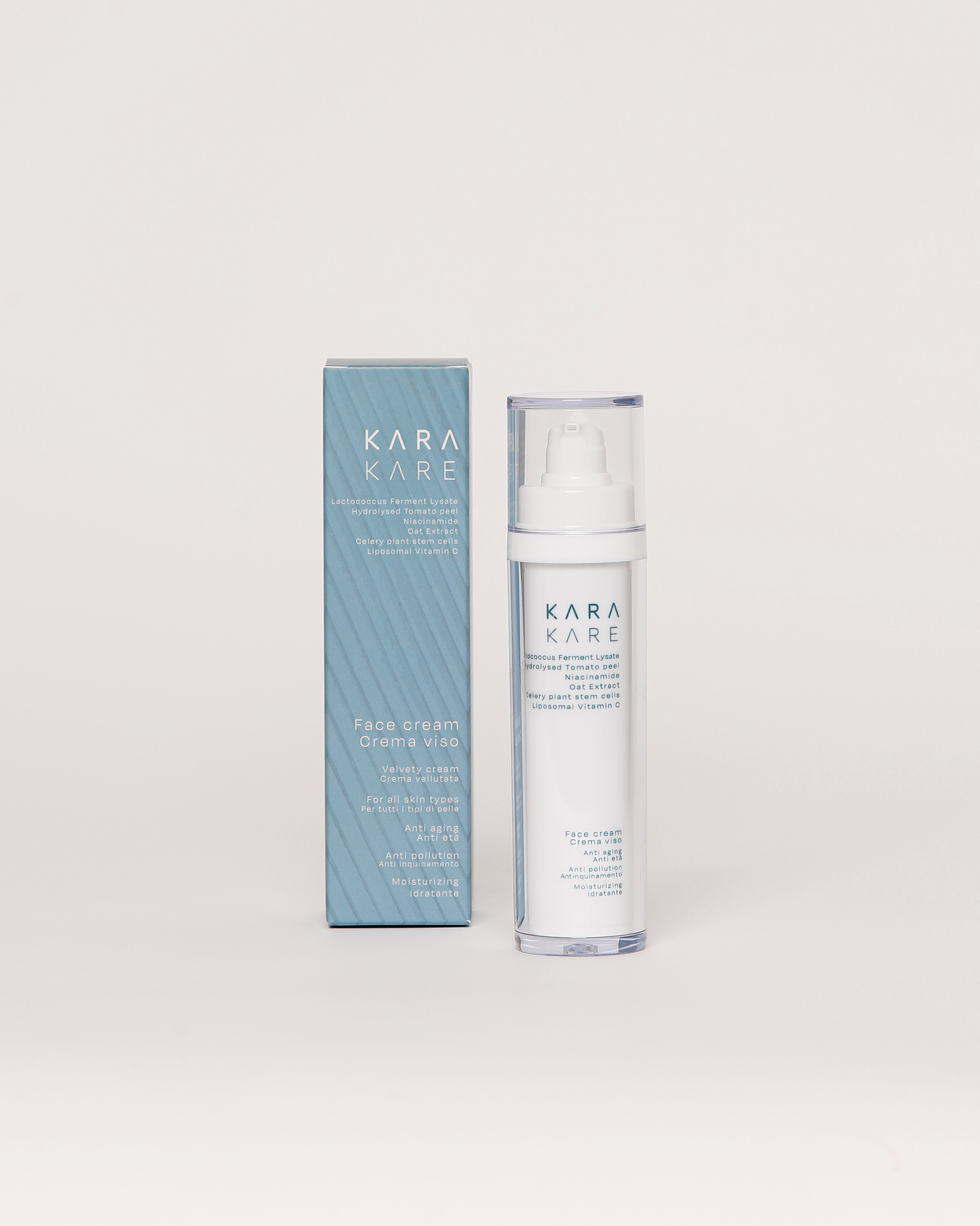
The packaging has the inclusion of patterns for visual interest. The textures aims to create to diffrentiate the packaging form other more minial aesthetics of other clean brands.
![]()
![]()
![]()
![]()
![]()
![]()
SUPPORT
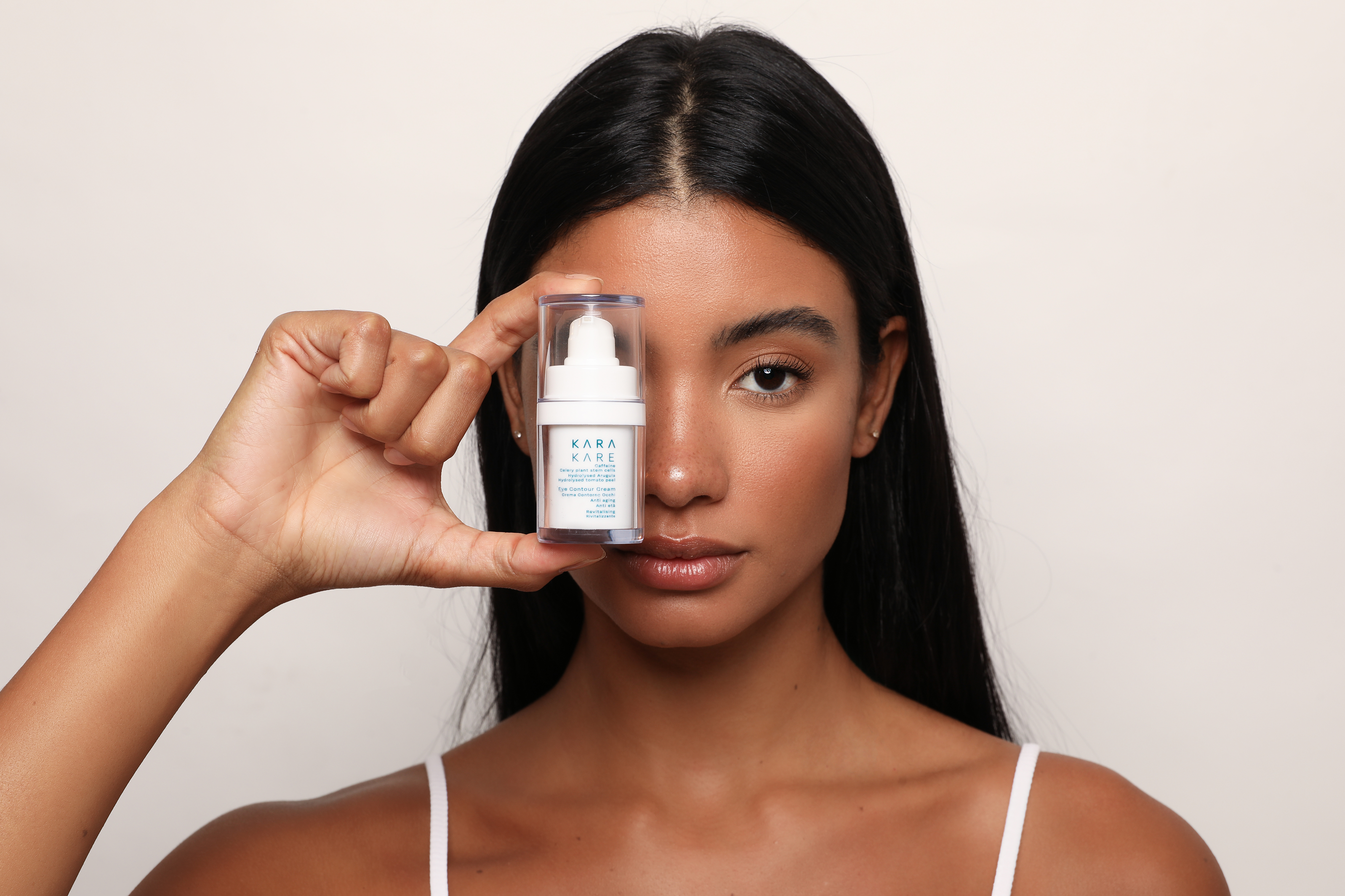
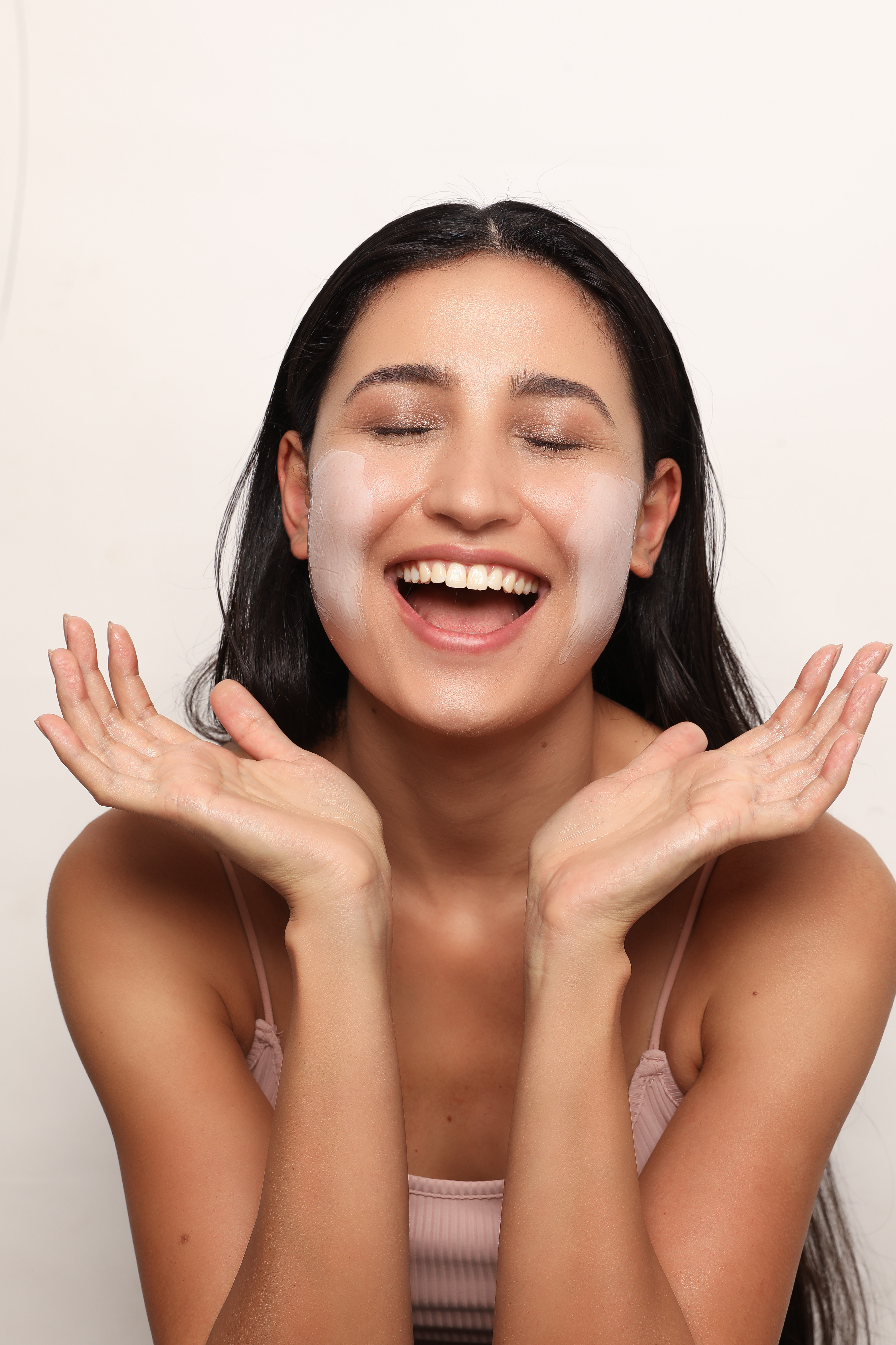
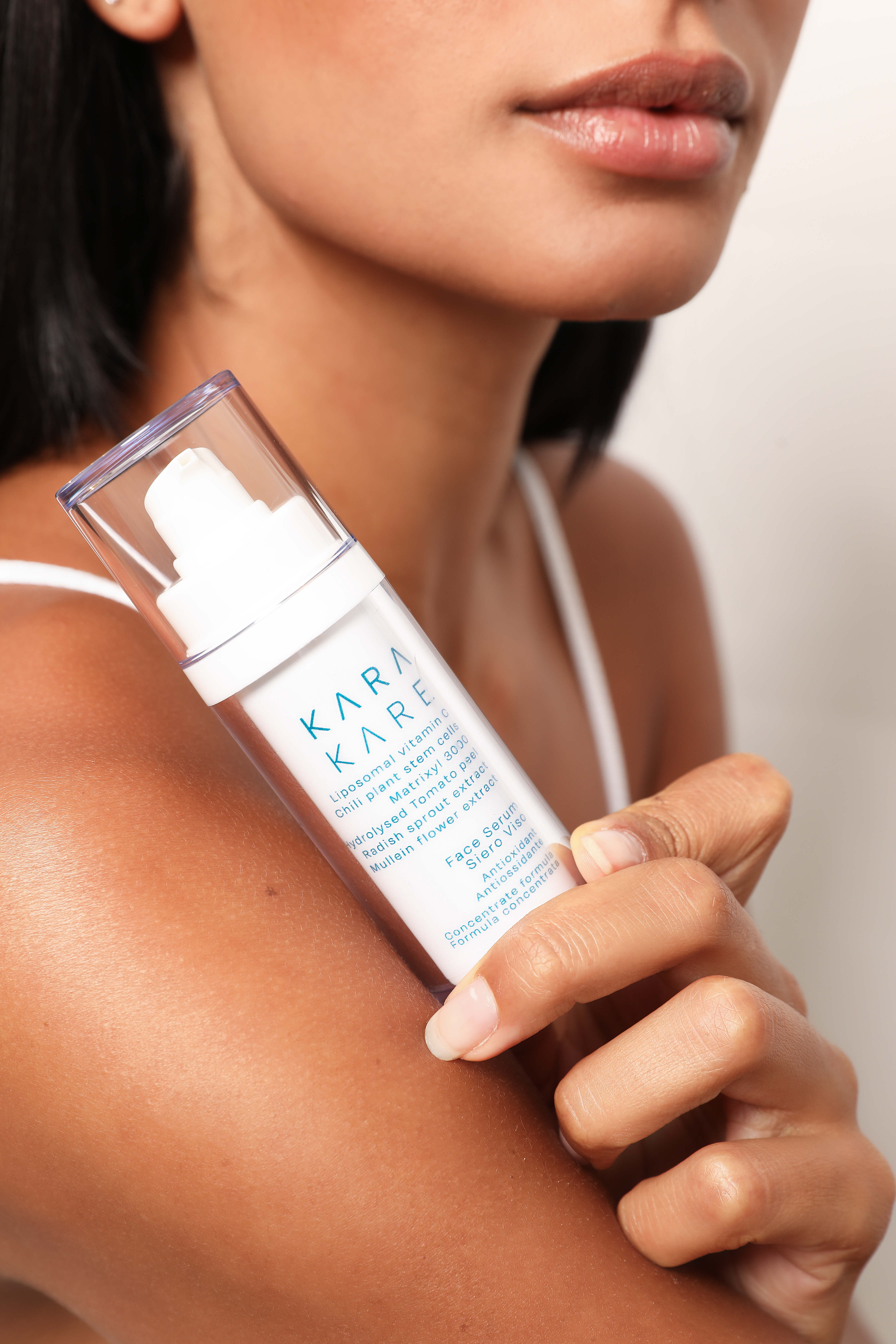
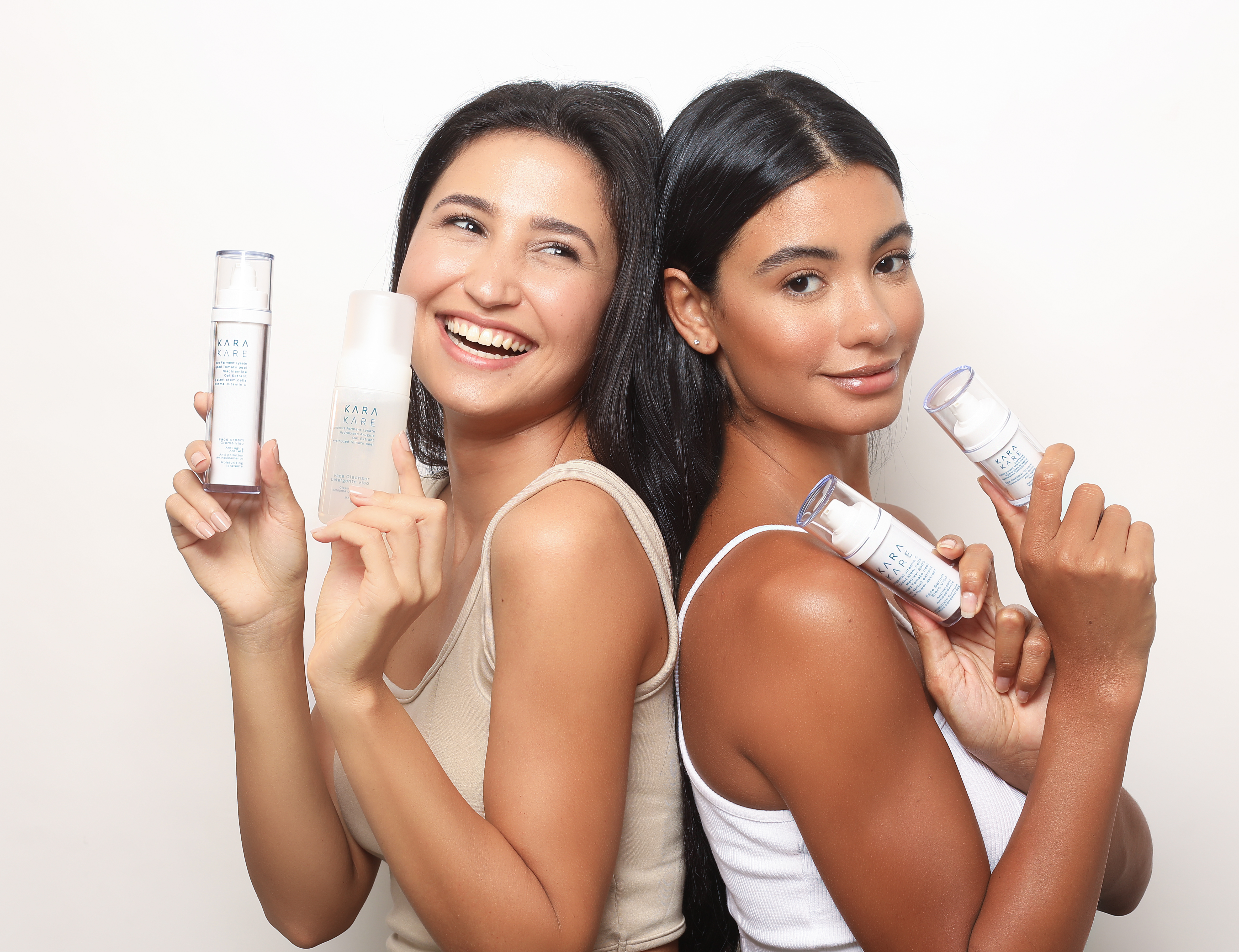
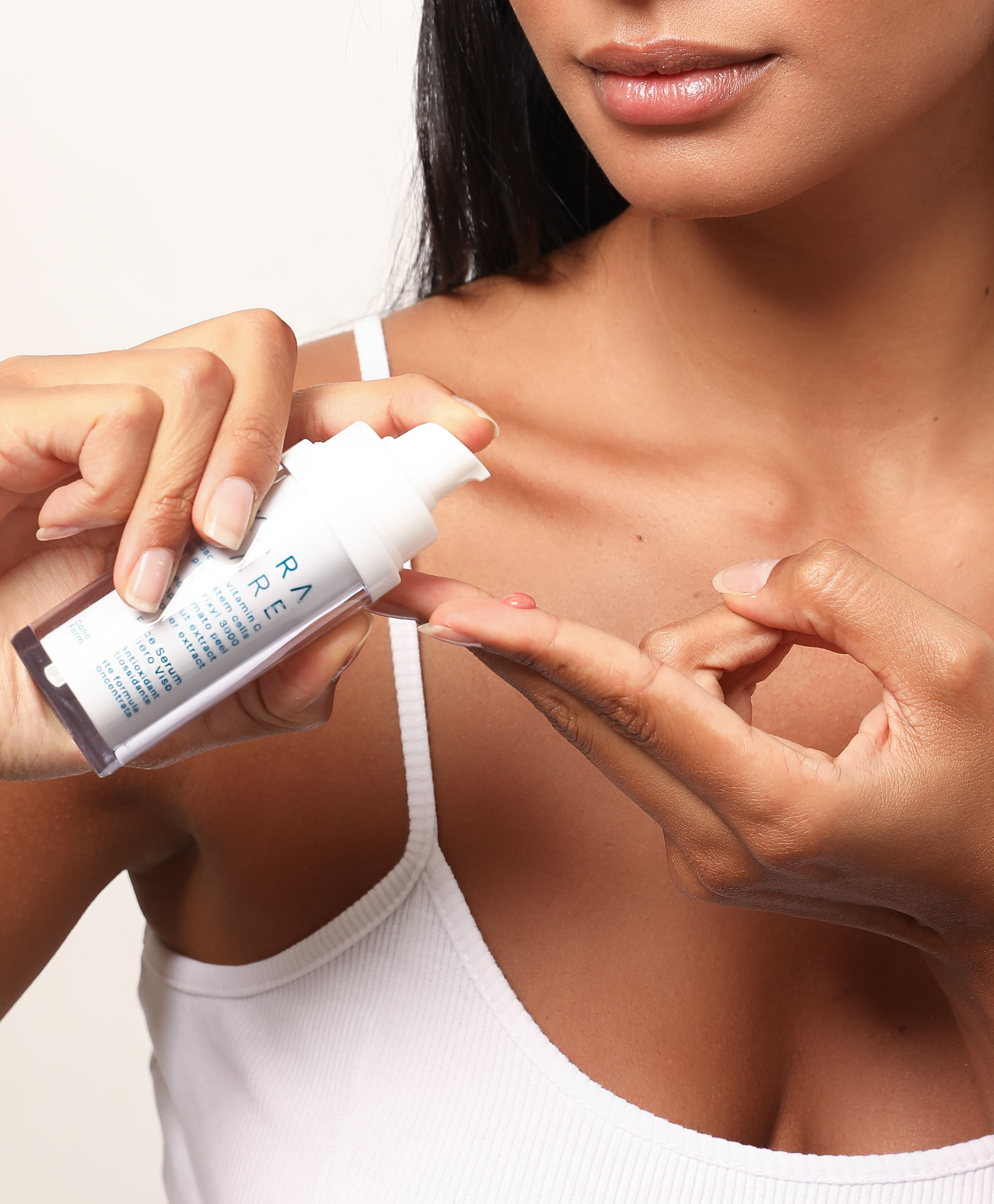
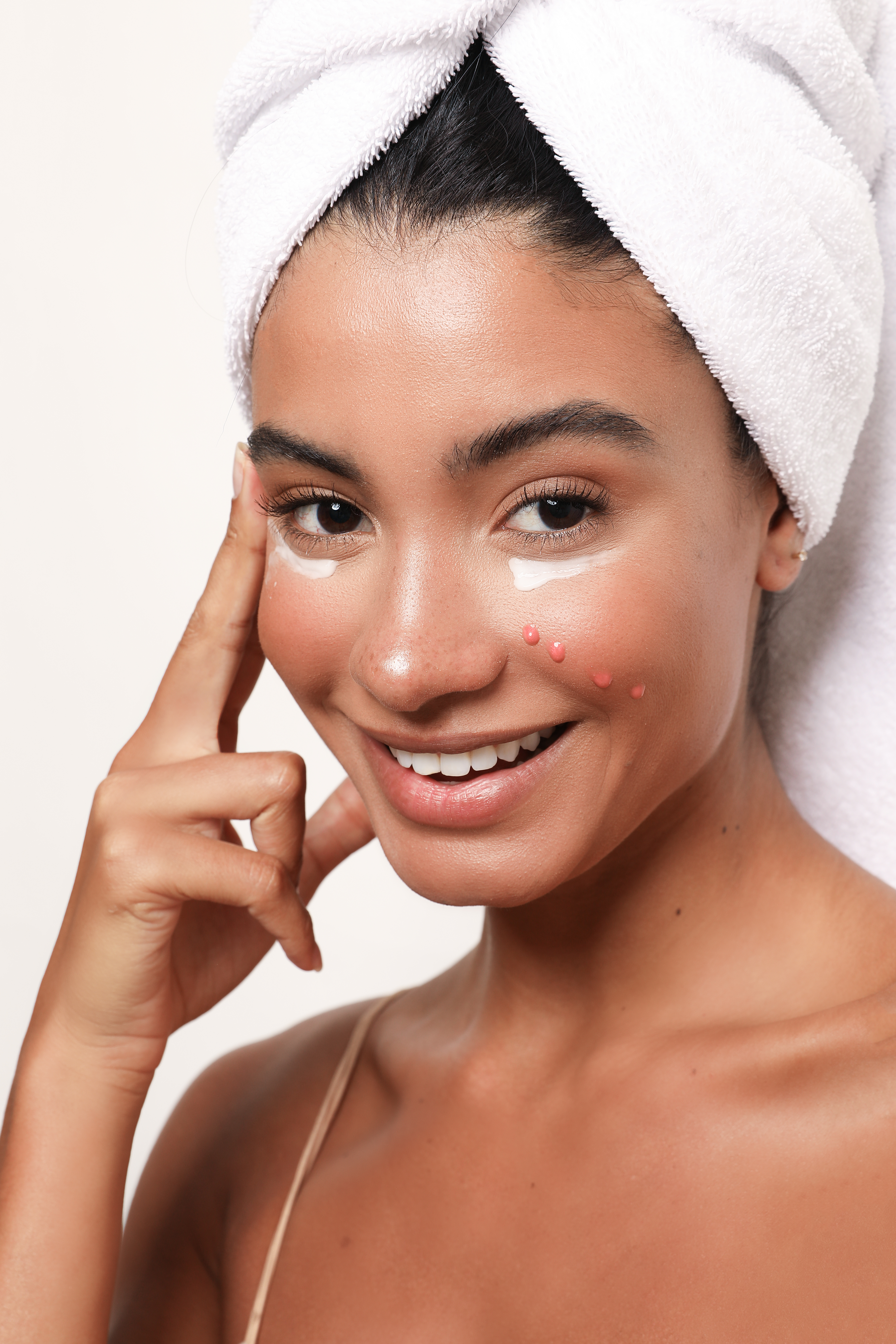
The strategy for the overall photography style, was to focus on natural healthy skin. Additionally the aim was to create an approachable atmosphere of simply enjoying the routine of the product application and highlight the ‘clean beauty brand’.
![]()
![]()
![]()
![]()
![]()
![]()
PHARMACEUTICALS & BIOACTIVE INGREDIENTS
Brand Tone:
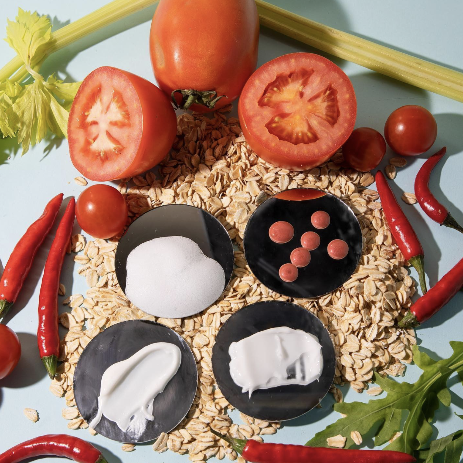
It was important to highlight the depth of knowledge that went into the development of the formulas. Additionally to showcase the ingredients extracted from nature and even the ones created in the laboratory are high quality ingredients.
![]()
![]()
![]()
![]()
Year: 2021
Client: Amanqi Consulting
Kara Kare: ︎ @karakarebeauty
︎ www.karakarebeauty.com
BRAND STRATEGY
An important element before developing the design of the brand was creating the strategy. The strongest point of the brand is that the owner has an extensive depth of knowledge in pharmaceuticals, with a background in Pharmacy and a masters in project management specialised in biology.The foundation of the formulas started from «Prevent and Treat», exactly the same way medication functions. It works to treat the skins ‘Microbiome’.
BRAND MANIFESTO:
With its ethos deeply rooted in sustainability, Kara Kare is devoted to creating products that protect and treat the microbiome. Our formulas have been developed using biotechnology, combining the benefits of plant extracts and various enzymatic mechanisms with the most effective active ingredients. We are committed to making a positive impact on the environment, through the use of ‘upcycled’ ingredients that would otherwise be wasted and by minimising the carbon footprint of our supply chain.

An important element before developing the design of the brand was creating the brand name. KARA KARE come from founders name as the playing with the interesting alliteration with the word ‘kare’ in place of ‘care’. The brand name is aimed to be sold in various markets so it was imperative that the brand name was easy to read and pronounce.


The packaging has the inclusion of patterns for visual interest. The textures aims to create to diffrentiate the packaging form other more minial aesthetics of other clean brands.
SUPPORT
The strategy for the overall photography style, was to focus on natural healthy skin. Additionally the aim was to create an approachable atmosphere of simply enjoying the routine of the product application and highlight the ‘clean beauty brand’.
PHARMACEUTICALS & BIOACTIVE INGREDIENTS
Brand Tone:
It was important to highlight the depth of knowledge that went into the development of the formulas. Additionally to showcase the ingredients extracted from nature and even the ones created in the laboratory are high quality ingredients.


Year: 2021
Client: Amanqi Consulting
Kara Kare: ︎ @karakarebeauty
︎ www.karakarebeauty.com